University of La Verne portfolio brand lockup is composed of a circular symbol, a portfolio wordmark, divider line, and the University wordmark.
Only colors from the university’s primary, secondary, and tertiary palette, and black and white may be used in the portfolio brands (see Our Colors page).
The university wordmark and center name will always be in La Verne green (PMS 350), or black or white.
Avoid reversing the logo out of a photograph or complex background.

AnatomyA University of La Verne portfolio brand lockup is composed of a circular symbol, a portfolio wordmark, divider line, and the University wordmark |
 |
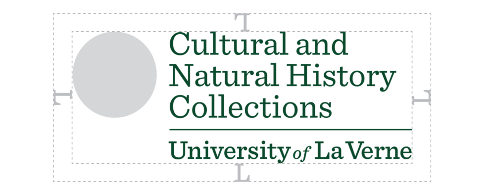
ClearspaceMaintaining ample clear space around the logo ensures that it remains legible and doesn’t get lost within the composition. Photos, text, and graphic elements should never be placed within the clear space, as shown here. Do not attempt to typeset or create any logos on your own. New logos should be undertaken only in consultation with the Office of Strategic Marketing and Communications.
|
 |
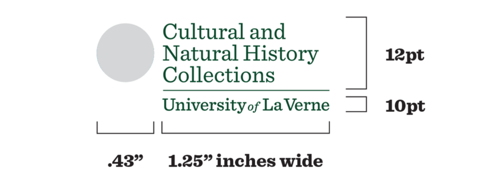
Minimum SizeTo maintain full legibility, never reproduce the sub-brands at widths smaller than what is shown here, either for print or screen. There is no maximum size limit, but use discretion when sizing the sub-brands. It should never be the most dominant element on the page, but the logo instead should live comfortably and clearly as an identifying mark.
|
 |