The University of La Verne’s primary wordmark is the cornerstone of our visual identity. Applying it consistently and correctly establishes a recognizable identity.
The signature should be used in its entirety unless space or layout concerns require one of the alternate configurations. The primary wordmark should only be reproduced from authorized digital files. Do not attempt to typeset or recreate the mark yourself.
Primary Wordmark (Stacked)There are two approved primary signatures: a stacked version and a horizontal version. The stacked version is the preferred signature and should be used whenever the layout allows. |
|
Primary Wordmark (Horizontal)The horizontal version is reserved for applications where the area for the logo is restricted vertically. |
|
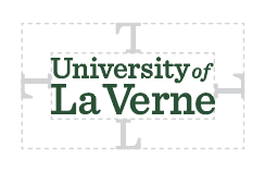
Clear SpaceMaintaining ample clear space around the primary logo ensures that it remains legible and doesn’t get lost within the composition. Photos, text, and graphic elements should never be placed within the clear space, as shown here. |
|
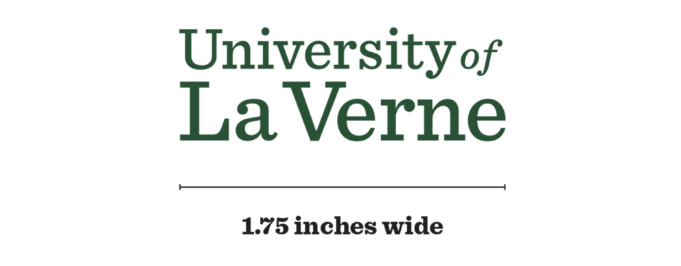
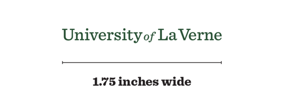
Minimum SizeThe primary logo should be applied at a minimum of the approved sizes displayed on this page. There is no maximum size limit. If a large application is required, e.g., signage, vehicle wrap, billboard, etc. the logo can be increased to a logical size.
If unsure, The Office of Strategic Marketing and Communications can give advice in these instances. |
Minimum Size (Primary)
Minimum Size (Primary – Alternative)
|
Incorrect Use
Incorrect uses of the primary wordmark are shown below. Incorrect usage rules apply to all wordmarks and logos in the University of La Verne brand identity.
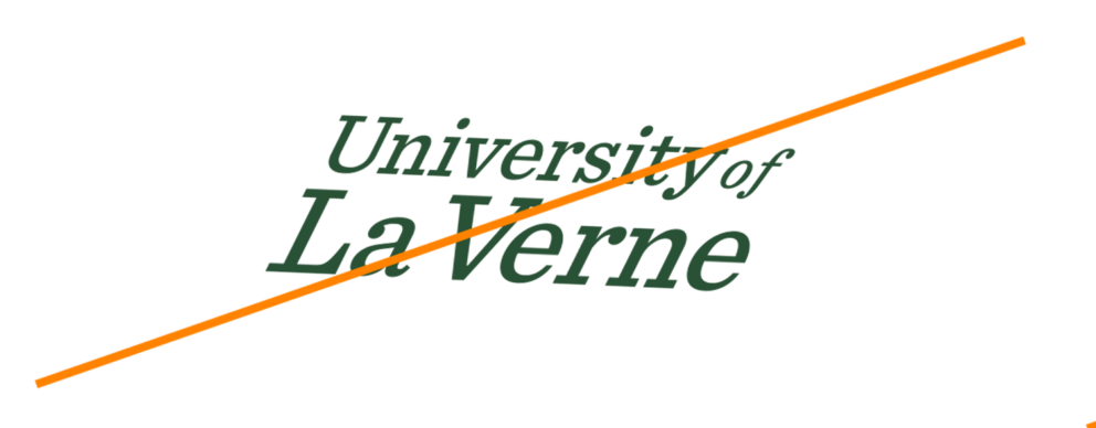
Don’t skew or bend the wordmark in any way. |
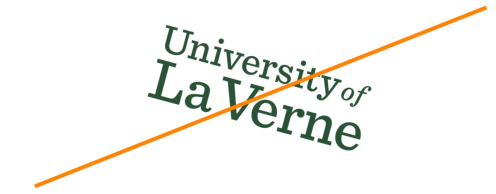
Don’t rotate the wordmark. |
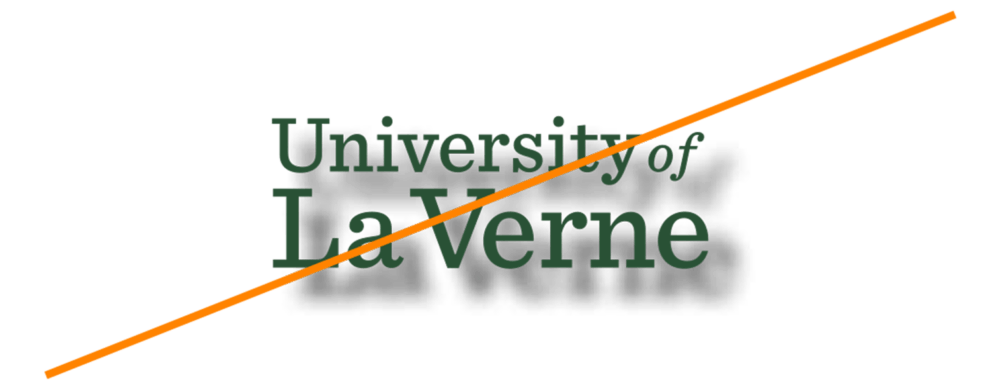
Don’t use drop shadows or other effects. |

Don’t use any color other than those specified here. |

Don’t stretch the wordmark. |

Don’t crop the wordmark. |

Don’t use another typeface for the wordmark. |

Don’t change the scale of the wordmark’s elements. |
