Our Typography
Our words carry weight, and so does our typography. The size, font, and style of the typefaces we choose are some of the most recognizable aspects of the University of La Verne brand. This section will help you skillfully match our typography with the message.
Paying careful attention to typography selection will help our communications read loud and clear.
Headlines
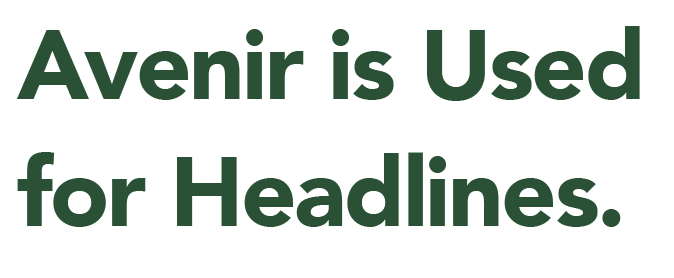 Avenir is Used for Headlines.
Size: 32 pt. / Leading: 42 pt.
Avenir is used primarily for headlines, but can also be used for subheads and call-outs. It offers a wide range of weights that can be used for both large display type and for smaller subheads.
Body Copy
Sentinel is used for body copy.
Size: 9.5-12 pt. / Leading: 15-18 pt.
Sentinel is used in body copy. Sentinel has a classic feel that helps convey the integrity and rich history of La Verne.
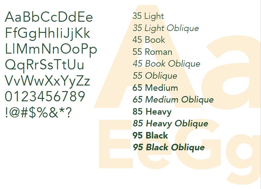
AvenirOur primary sans-serif typeface is Avenir. Avenir has a harmonious and sensible appearance which lends itself nicely to both text and headline use. It is available and approved for use in a variety of weights. If Avenir is unavailable to you, or you need a web-safe alternative, Arial may be substituted. NOTE: Avenir may be purchased and licensed at MyFonts.com. |
 |
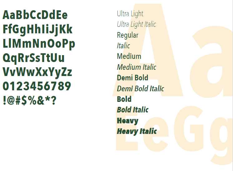
Avenir Next CondensedOur secondary sans-serif typeface is Avenir Next Condensed. There is no web-safe alternative to Avenir Next Condensed. If you want to use this font in a web capacity, you will need to purchase a web-specific license for it. NOTE: Avenir Next Condensed may be purchased and licensed at MyFonts.com. |
 |
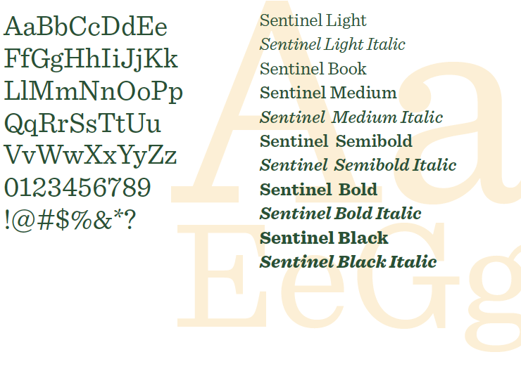
SentinelSentinel is a classic typeface. It pairs well with our modern sans-serif, Avenir, and the two combine nicely for body text. The typeface is available and approved for use in a variety of weights. If Sentinel is unavailable to you, or you need a web-safe alternative, Minion may be substituted. NOTE: Sentinel may be purchased and licensed at Typography.com. |
 |